Report
Last updated
Last updated
This is the second most important task within Gaio. With it, you can build different types of graphs and customize a table with statistics on your data.
To start a report, there are three paths that can be used right after clicking on the table that will be used as a source:
In the tasks menu, choose the Reports task
Right click on the table and choose Reports
Right after clicking on the table, open a horizontal menu at the top that has the Reports option
It is generally used in Dashboard-type processes, as they will be accessed by users who do not have access to the Studio of that application.
It is super important to carefully evaluate the construction of the process that will be a dashboard. If many queries are carried out, it can slow down those who access the dashboard. A good practice is to prepare the data in a previous process (which can be automated to update the data) and in this process where reports are inserted, only one query is used, in which filters are applied that will allow the user to filter the data on the dashboard.
It is not possible to create Reports directly on tables from external sources (e.g.: Oracle, MySQL, SQL Server, etc.). Only in tables that are already in Gaio (red tables).
In the upper left corner, the number of rows in the table is displayed, as well as a search box to find a specific column in the report's source table.
All columns listed can be sent to the report by double-clicking or dragging to the area at the top center
This area at the top contains all the columns used in the report.
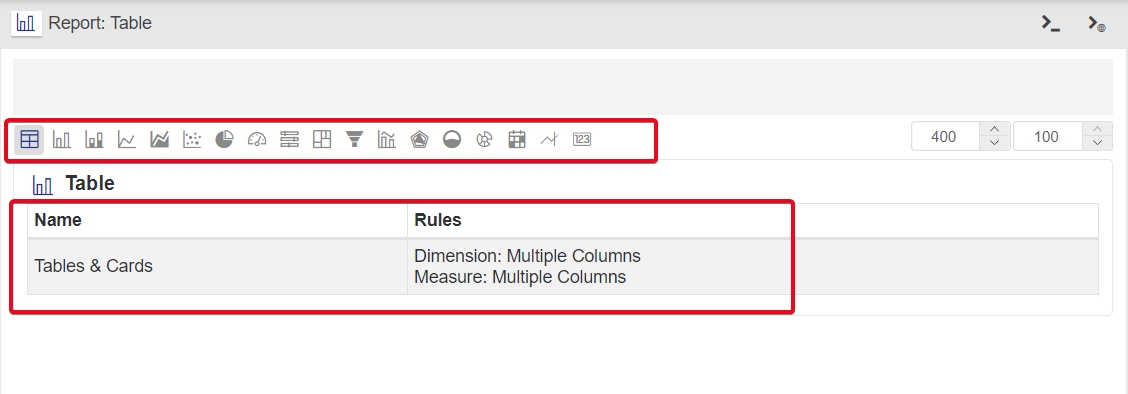
Choose between the table and the various graphs available to better represent your data. Before bringing the columns to the area at the top, an explanation of which columns each chart type expects is presented in the area below the chart buttons.
You can pre-sort the table by available columns. You can also allow the user to filter values in any column of the table report.
You can create calculated fields.
You can use calculated fields that have been defined as global.
It is possible to apply filters to the report that will always be used regardless of the user's choice. For example, it is possible to filter the sales of the user who logged in to Gaio (using Parameters). This way he will only see his sales.
The menu on the right shows the general settings for the Report as a whole, but when you click on a column in the area at the top center, the settings for the chosen column are shown.
In the Report settings, in addition to several other features, it is possible to create a button that opens forms, that is, the user can enter information regarding that line. This feature opens up a wide range of possibilities, where the user can:
Update that row from the source table
Delete that line
Send a message
Simulate a scenario related to that line
Among many other possibilities in building the process that will be called from this button
Hidden columns (Item 3)
In the report, it may be desired to include a Link (will be explained below). All report column values will be passed, however, it may be necessary to pass values for columns that should not be displayed. Therefore, this column will appear in the area at the top, however it will not appear in the table/graph. This hide option is in the menu on the right, which also presents the settings for the selected columns.
When you decide to use a column in the Table Report , several formattings apply to the columns. These settings appear in the menu on the right and allow you to change the column name to apply color and icon formatting based on the values that appear in the column itself or in another column.
It is also possible to place a link in the specific column that will call another process, passing all the values in the row as a parameter so that this process, for example, can filter the data or use it for others.
For each chart type, a custom menu appears on the right.
Pay attention to the fact that you can use a table with 100 million rows to place in a graph. Generally so much data in graph will crash the Internet Browser . Therefore, Gaio automatically limits 50 lines to be displayed on the screen. If you have 60 product categories, or 70 dates to be displayed in a line chart, Gaio will only use the first 50. However, to increase this amount, simply click on the Lines displayed item and change the value to an appropriate amount, but not too high and causing difficulty in viewing.
In some situations, it is necessary to click on the button marked below to update the chart after changes to its settings.